
Friday, 24 April 2015
Thursday, 23 April 2015
Final Piece
This is my final piece for unit 4.

Firstly I Chose an image of a forest landscape from Pinterest this is the photo after it had been live traced with illustrator, using 12 colours. It gave me a really nice background to work on top of.


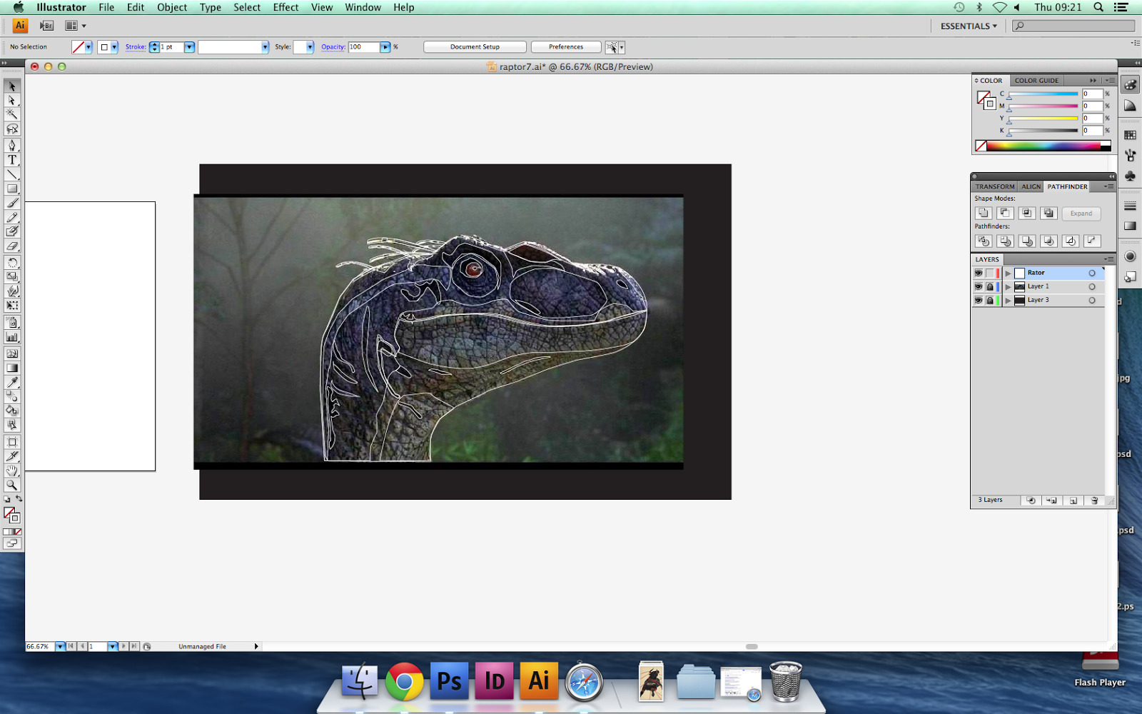
Next I started to draw a veloceraptor using illustrator, here are some work in progress shots.


Overall once I had used photoshop brushes to add the scales i was not happy with the final result. In turn I didn't use this in my final piece.
Next I started to draw the Character Muldoon as he was the centrepiece of my piece. I placed a picture of him into illustrator and started to draw him. here are some work in progress shots.


After finishing this I placed it into photoshop, after playing around with the placement I finally was left with this.


Then for my tagline I used my typeface I had created earlier in the unit. to read 'Clever Girl' a well known Quote from the film when Muldoon is attacked by the velociraptor. Once I was happy with the placement of the words, I used a colour overlay to make them stand out much more and make them a deep black rather than a light grey.

I then added the credit block aswell as other bits found on the original poster.


Lastly I thought the poster needed some element of the dinosaurs, so I drew a veloceraptor in illustrator for use as a sillouette in the shadows. heres the work in progress.


Once added and placed I was left with this.

Wednesday, 22 April 2015
Colour Schemes
In this post I will experiment with different colour schemes on my final draft, this will help when it comes to creating my final piece, and which colour scheme to use.
Analogous

This is my final draft roughly coloured in an analogous colour scheme. To create an analogous colour scheme, I used three different colours next to each other in the colour wheel. In this instance I used shades of green, from dark to light.
Complimentary

For this draft, I used complimentary colours, as green being my main colour (forest scene) I used its complimentary colour red to create this scheme. The effect this gave me was not what I wanted, the sunset provides a pathetic fallacy of happiness. With this scene of the movie being scary and dark, this did not fit well.
Monochromatic

In this colour scheme I used different shades of green and i tried to add the darkness to the scene. this worked well and provided a nice draft for the colours I will use.
Monday, 20 April 2015

Friday, 17 April 2015
Thursday, 16 April 2015
Emulation
This is my Emulation for unit 4

Firstly with this project I created the Jurassic park logo, even though I did not use it it was still an important part of the development process. Here are the work in progress shots.


Next I started drawing one of the characters from the film, I wanted him to be less detailed so that it looked less of a photo but more of a graphic. So when I drew him I left small details out as well as some of the shading.


After I had finished the colouring process, I moved on to a quote from the film. Below is my quote developing into the final used, I used my one typeface I had made in this unit.


At this point I thought that there was too much going on on the poster, and decided to scamp out different ways I could finish the poster.

Once I had made my decision after moving things around on illustrator I was left with this final poster.
Subscribe to:
Comments (Atom)